页面设计的细节
无论做什么事都要秉承着细节决定成败,在网页设计当中更是颠扑不破的真理。一个优秀的作品与卓越的作品相比差距就在于细节的把控。那么页面设计的细节有哪些呢?下面一起来看看吧!
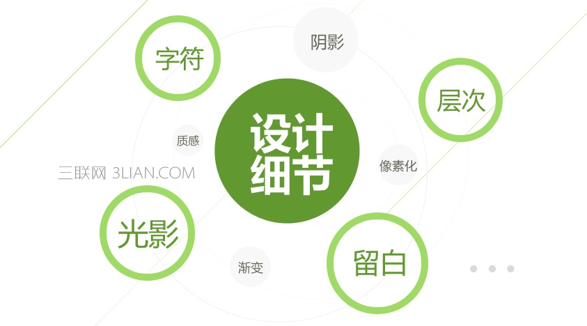
页面设计的细节总结
字符
字符是页面中不可缺少的部分,页面上最重要的部分。所以这部分细节是最基础的,也是最不可忽视的。网页上80%的信息是以文字形式传达的,任何网页元素都无法替代文字的作用。网页中文字设计的好坏会直接影响到整个页面的视觉传达效果。
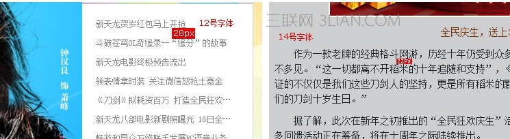
字号
字号的选择是根据功能需要而定的,字越大给浏览者的视觉冲击力越强,一般用于标题或其他需要强调的地方。小字整体性强,页面易产生多个中心,缺乏美感,时间略长,浏览者易产生视觉疲劳。最适合网页的字体大小为12磅,如果在一个页面内容较多,通常可以用9磅的字号,随着互联网飞速的发展,在内容较多的情况下10.5磅字号逐渐替代了9磅字号。游戏行业本身侧重于视觉传达,在官网及专题里文字都不会像门户类页面那么多,所以常规情况下最小保持10.5磅以上字号。
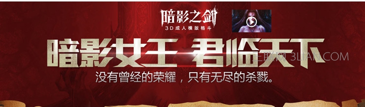
标题文字的运用
内容字体的运用
字体
不同的字体有不同的性格表现,严肃、幽默、力量、柔软等等。网页中比较常用的中文字体有宋体、黑体、楷体、隶书等。根据不同的页面主题可以选择不同性格的字体搭配。
标题字体的选用对整个页面的编排起着重要的作用。字体选择、字体特效到位,不仅会突出页面主题,而且还会烘托整个页面的气氛。
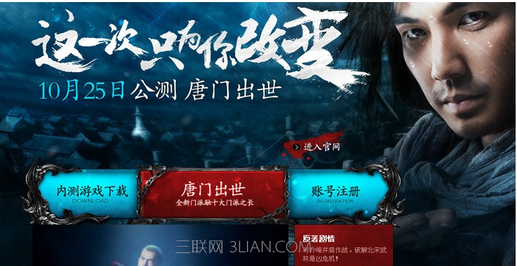
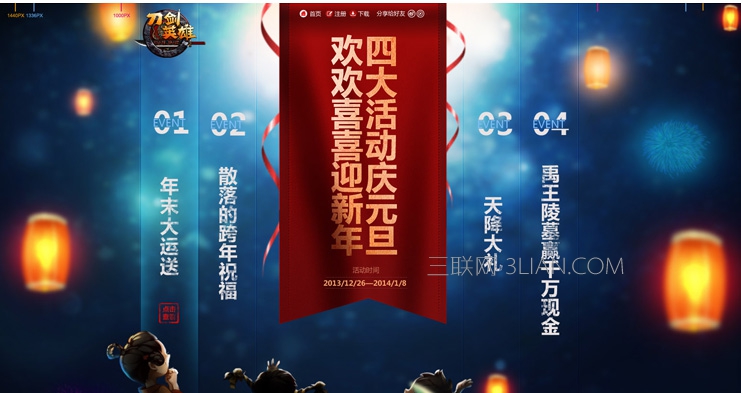
主标题用毛笔字体,副标题选择用了方正楷体简体与主标题进行搭配,突显游戏武侠风格特点,导航文字选用了与副标题相同字体,内容用微软雅黑字体。整个页面一共选用了三种字体。
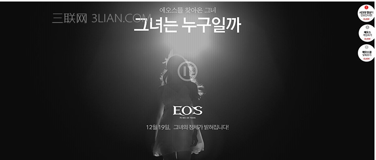
主标题字体微变型,副标题选用了微软雅黑细体。
样式
文字的样式主要包括常规、粗体、斜体等。正文中的文字宜采用常规样式,标题宜采用加粗或斜体样式。合理的运用文字样式,将更有利于文字的视觉传达,更有利于浏览者的阅读。

间距
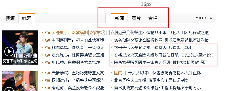
文字的间距分为横向间距和纵向间距即”字距””行距”。正文与标题的字距应该通篇保持一致,字距太大或太小都会导致可读性受到影响。行距的常规比例为10:12即用字10点,则行距12点。除了对于可读性的影响,行距本身也是具有很强表现力的设计语言,有意识地加宽或缩窄行距,能够体现独特的审美意趣。
颜色
颜色的运用对于整个文案的表达会产生很大的影响。使用不同颜色的文字可以使想要强调的部分更加引人注目。色彩可以使得文本不受位置的局限,加强或者减弱文本的表现强度,使页面文本的浏览产生视觉导向。
排版
文字的对齐方式一般分为四种:左对齐、右对齐、居中对齐和两端对齐,其中左对齐和两端对齐最为常用,因为这两种对齐方式比较符合人们的阅读方式。
文字的排布方向主要有三种:横排、竖排和斜排,其中以横排为主,横排文字群体比较适合人们的阅读习惯。
留白
留白可以给人带来心理上的轻松与快乐,也可以给人带来紧张与节奏。元素之间的留白不能太大这是基本的原则,留白过多,页面会变得零碎。
页面设计是以传达页面信息为主要目的的,留白更多的是服务和服从于网页的可用性。无数的可用性研究证实了一个事实:在Web中,用户对网页信息是进行浏览,而不是阅读。简洁明快、富于美感的页面更具有可浏览性,可使用户获得更加良好的浏览体验。
留白空间不一定要是白色的。指的是任何与背景相同的空间。所以它可以是白色、黑色,其他纹理等。
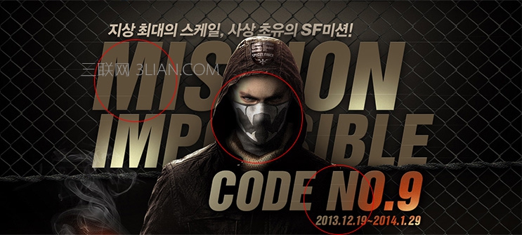
大面积的有色范围
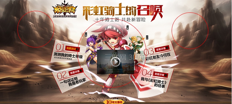
如在网页设计中只放置极少的必要元素,背景则用大面积的单纯色彩渲染,利用单纯色彩的力量来突出和烘托网页上的主要元素。边导航与主题内容的留白划分。
导航按钮
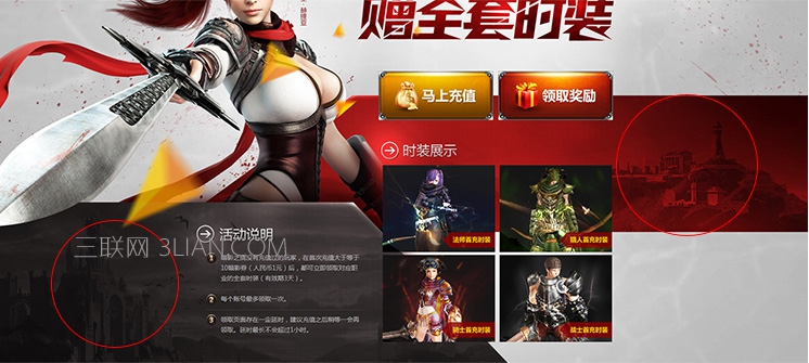
内容与图片
对比色留白

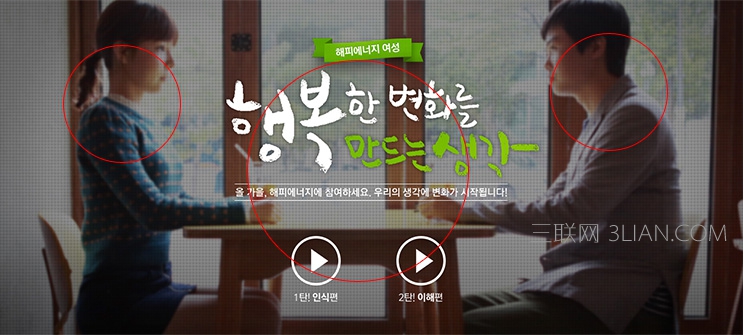
logo处留白
层次
网页设计需要层次感,当页面缺乏层次感的时候就会显得页面比较单调或者花哨。页面层次感可能有很多类型,例如色彩的层次感、元素的层次感等等。
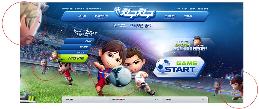
以足球场为背景,背景本身有深度,有远近景的层次感,人设采用远处模糊较小,近处清晰较大的视觉原理设计,使得页面更具层次感。
整个背景以清晰的山峰为背景,主要内容为近景形成层次,背景中心山峰与两侧的山峰形成层次。
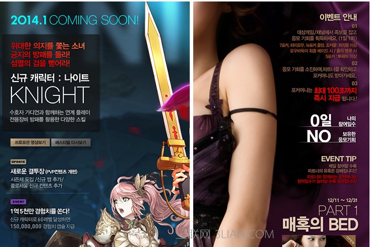
高斯模糊的背景与页面主要内容形成层次。
径向模糊及动感模糊处理的背景与页面主要内容形成层次。
标题与人设叠加产生层次感
红色块与灰色块形成层次感
光影
现实生活中无时无处不存在着光照和阴影。看到的每样东西都是通过光影反射形成它的形象。视觉上,光影帮助我们辨别事物,认知他们的材质、尺度和透视。
所以如果要让我们的页面设计更加自然、有动感且真实直观,正确理解光影效果就变得非常重要。
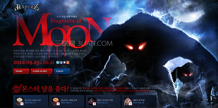
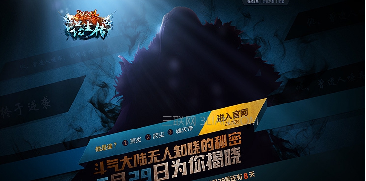
光源在人设背后,照亮背景与人设边缘,与人设正面形成对比。
光源在人设侧顶端。

光源在页面顶端,发散照射。
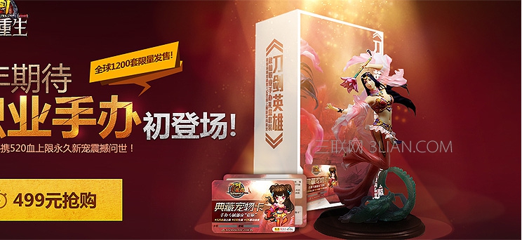
光源在页面顶端,往下方照射在产品上,突出产品的品质。
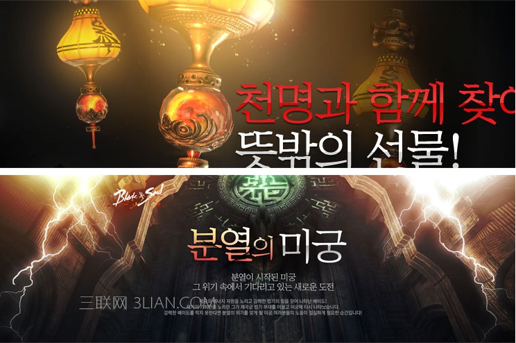
以元素为光源,照亮周围。
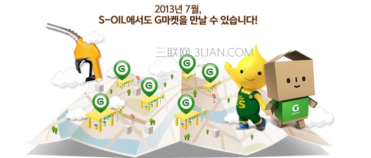
光影的运用给人带来的视觉是地图铺在地面上,地图的折叠效果体现出立体感很强,云的影子表现出云在漂浮。
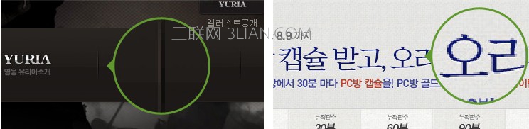
左图1像素浅色和1像素深色线与背景行成对比而形成。右图文字底部的细微高光使文字显得有种突出感。
光影在网页设计中使用方法及用处还有很多,比如增强页面气氛、突出主题等…
总结:影响页面细节的因素还有很多,比如质感纹理、图标、色彩等,这里就不一一介绍了。有不对的地方还望大家指证,希望对大家有所帮助。谢谢!~
留白
留白可以给人带来心理上的轻松与快乐,也可以给人带来紧张与节奏。元素之间的留白不能太大这是基本的原则,留白过多,页面会变得零碎。
页面设计是以传达页面信息为主要目的的,留白更多的是服务和服从于网页的可用性。无数的可用性研究证实了一个事实:在Web中,用户对网页信息是进行浏览,而不是阅读。简洁明快、富于美感的页面更具有可浏览性,可使用户获得更加良好的浏览体验。
留白空间不一定要是白色的。指的是任何与背景相同的空间。所以它可以是白色、黑色,其他纹理等。
大面积的有色范围
如在网页设计中只放置极少的必要元素,背景则用大面积的单纯色彩渲染,利用单纯色彩的力量来突出和烘托网页上的主要元素。边导航与主题内容的留白划分。
导航按钮
内容与图片
对比色留白
logo处留白
层次
网页设计需要层次感,当页面缺乏层次感的时候就会显得页面比较单调或者花哨。页面层次感可能有很多类型,例如色彩的层次感、元素的层次感等等。
以足球场为背景,背景本身有深度,有远近景的层次感,人设采用远处模糊较小,近处清晰较大的视觉原理设计,使得页面更具层次感。
整个背景以清晰的山峰为背景,主要内容为近景形成层次,背景中心山峰与两侧的山峰形成层次。
高斯模糊的背景与页面主要内容形成层次。
径向模糊及动感模糊处理的背景与页面主要内容形成层次。
标题与人设叠加产生层次感
红色块与灰色块形成层次感
光影
现实生活中无时无处不存在着光照和阴影。看到的每样东西都是通过光影反射形成它的形象。视觉上,光影帮助我们辨别事物,认知他们的材质、尺度和透视。
所以如果要让我们的页面设计更加自然、有动感且真实直观,正确理解光影效果就变得非常重要。
光源在人设背后,照亮背景与人设边缘,与人设正面形成对比。
光源在人设侧顶端。
光源在页面顶端,发散照射。
光源在页面顶端,往下方照射在产品上,突出产品的品质。
以元素为光源,照亮周围。
光影的运用给人带来的视觉是地图铺在地面上,地图的折叠效果体现出立体感很强,云的影子表现出云在漂浮。
左图1像素浅色和1像素深色线与背景行成对比而形成。右图文字底部的细微高光使文字显得有种突出感。
光影在网页设计中使用方法及用处还有很多,比如增强页面气氛、突出主题等…
总结:影响页面细节的因素还有很多,比如质感纹理、图标、色彩等,这里就不一一介绍了。有不对的地方还望大家指证,希望对大家有所帮助。谢谢!~
本文地址:http://www.tuquu.com/tutorial/di309.html
